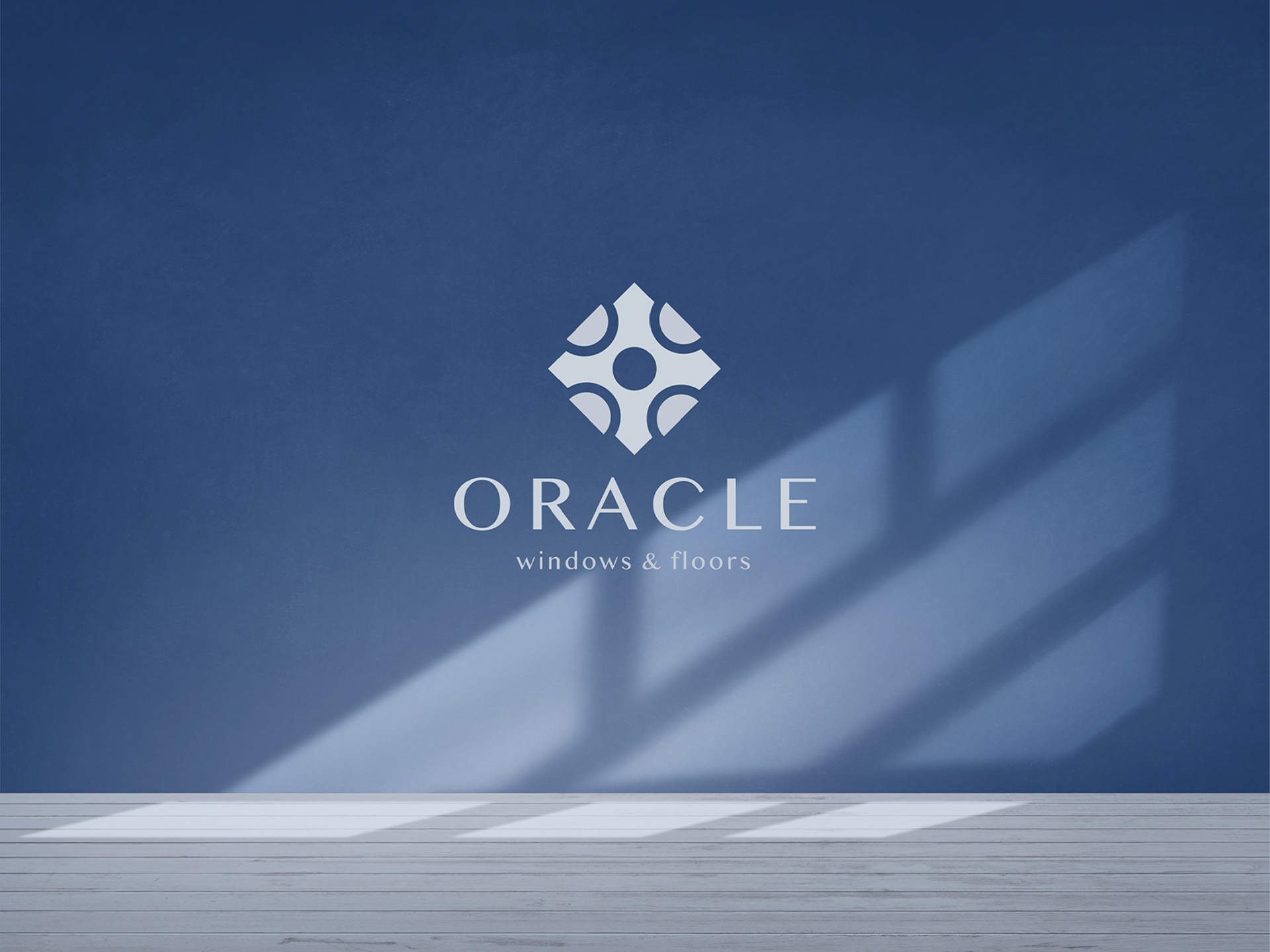
CLIENT
The City of Seattle
OBJECTIVES
Develop logo design and brand identity for The City of Seattle that includes the name and a symbol such as Space Needle or attributes of a port city. Use deep shades of blue referring to cold Pacific Ocean waters but without being too dark or too traditional.
SOLUTIONS
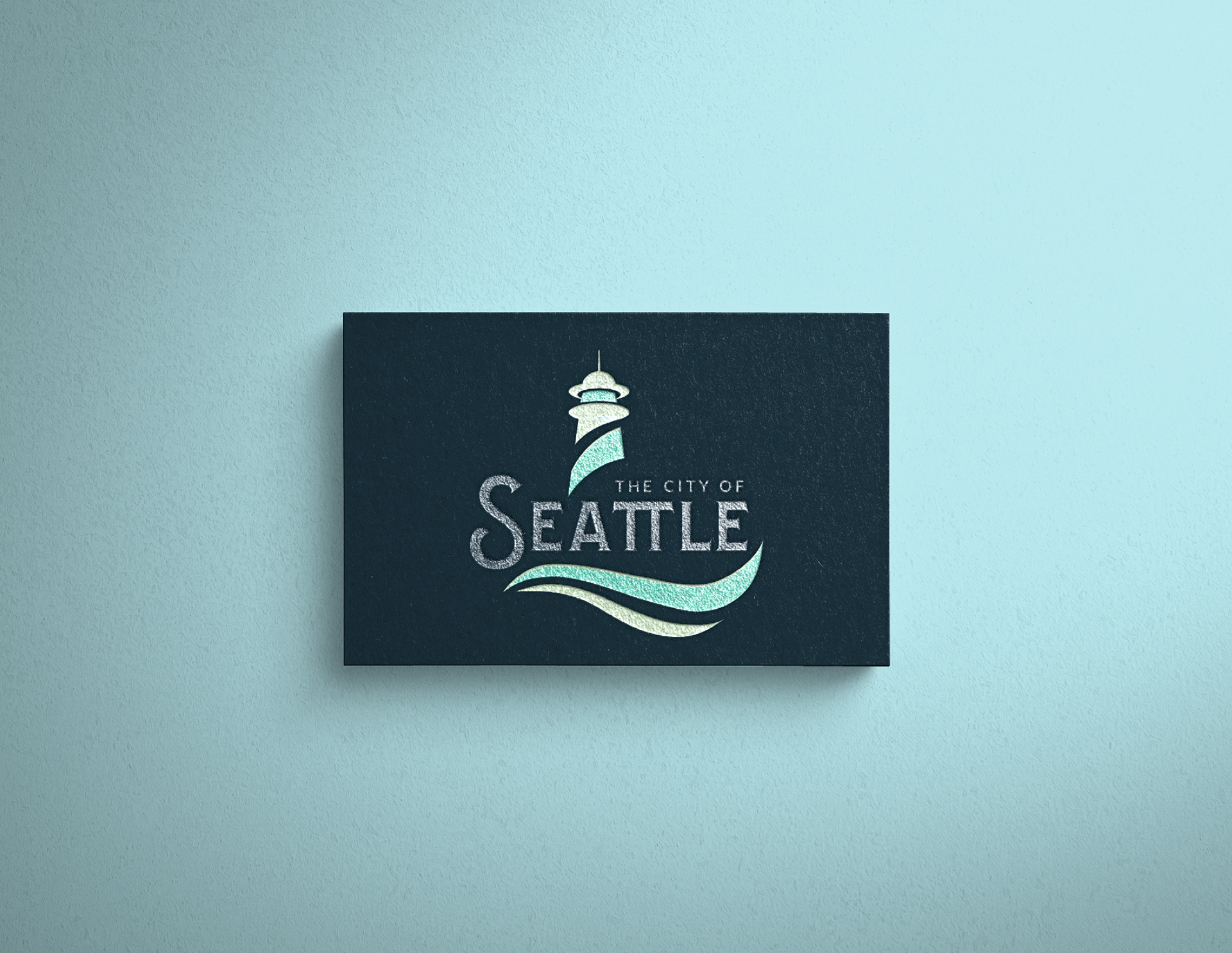
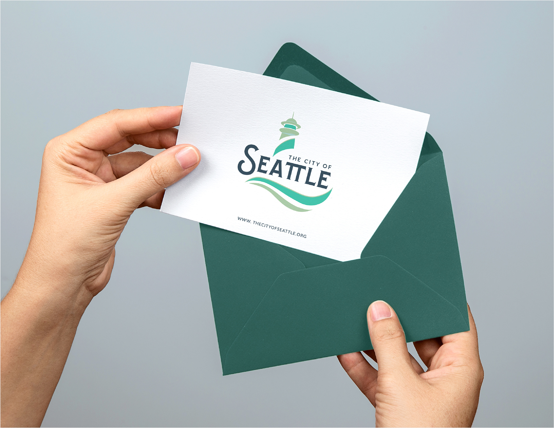
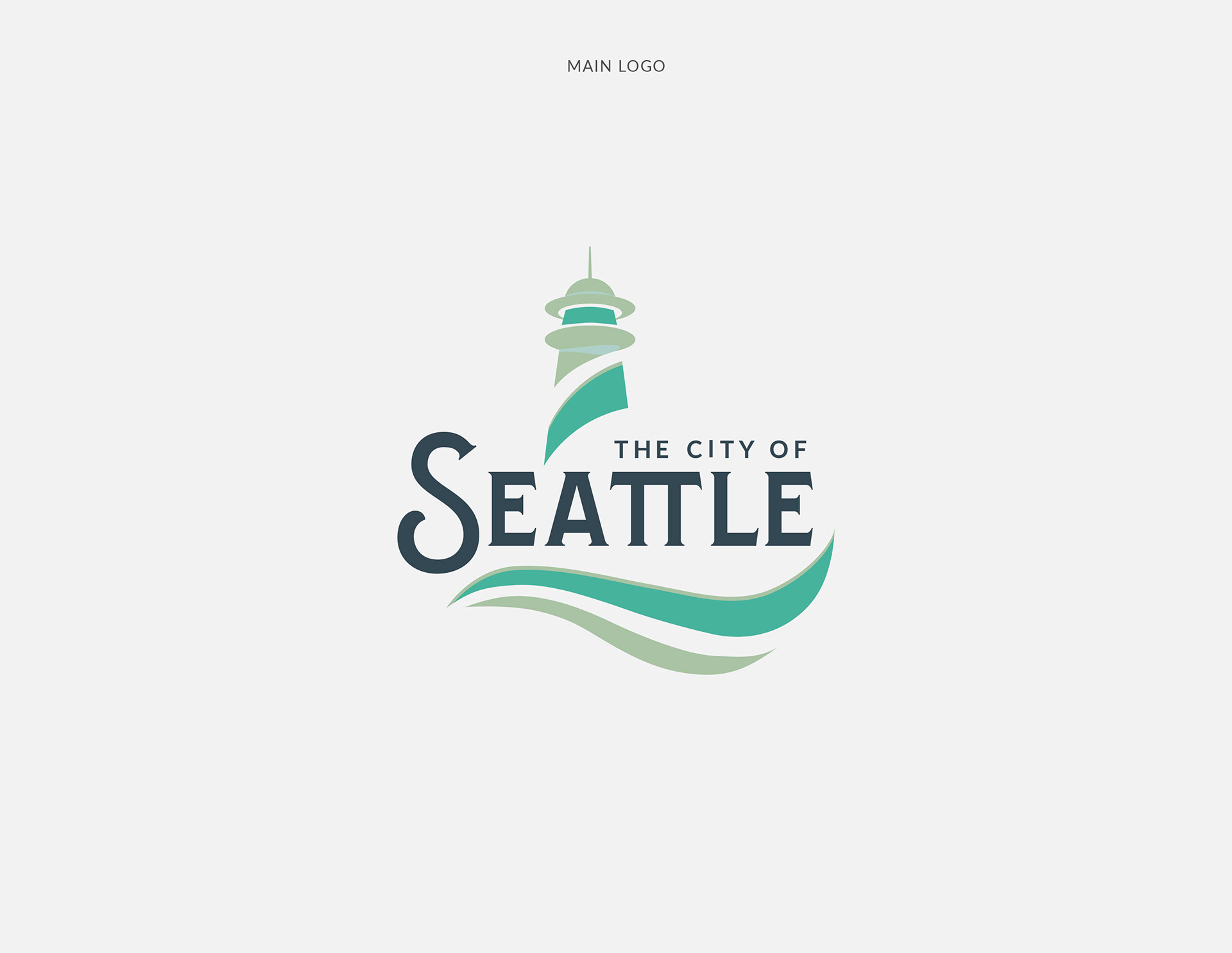
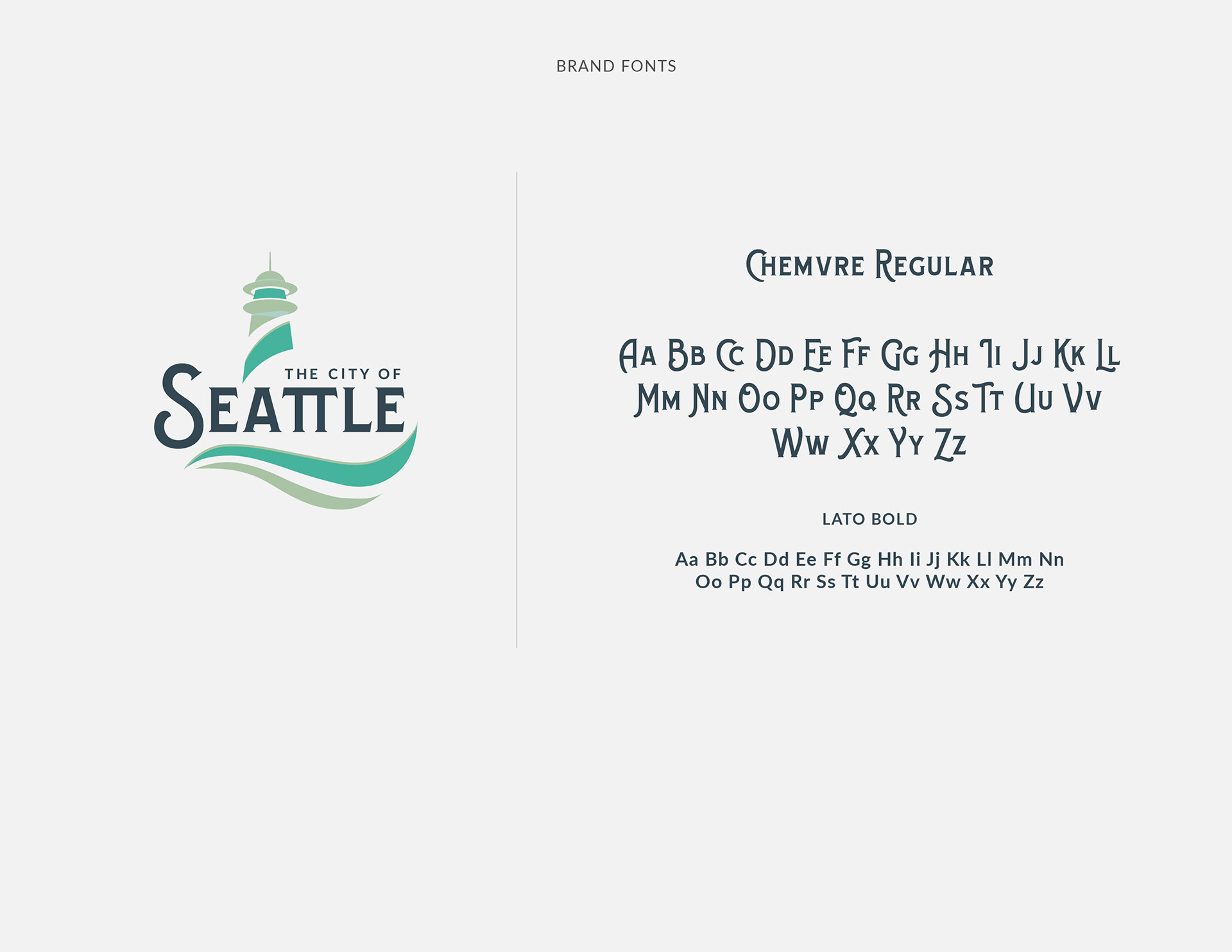
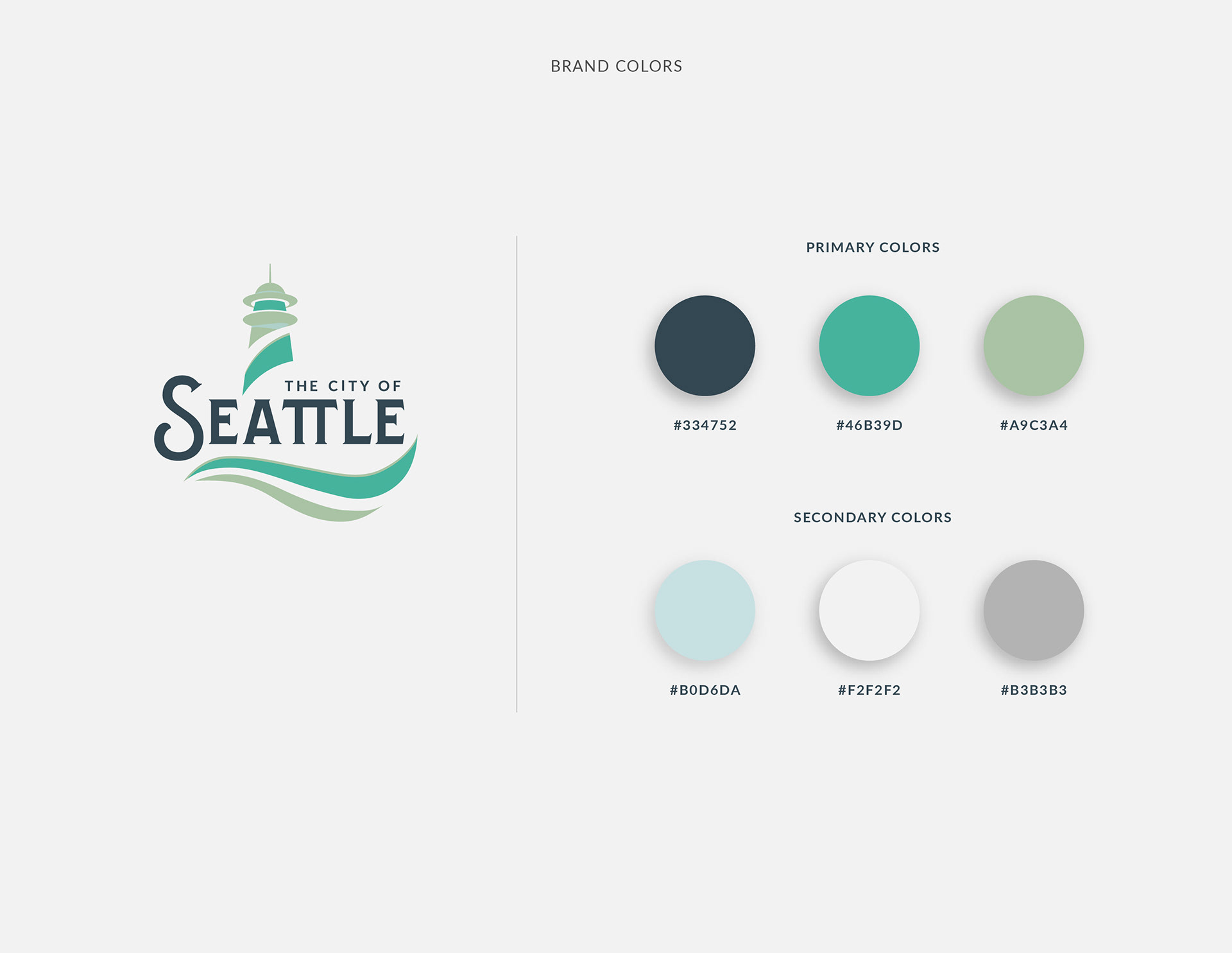
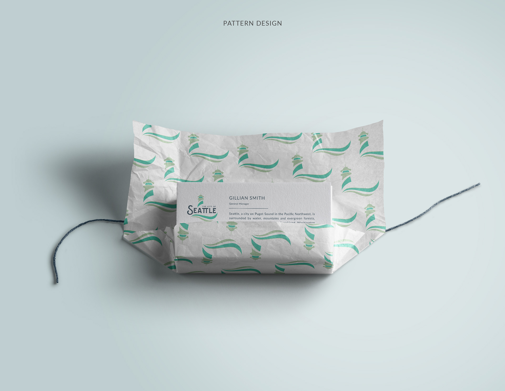
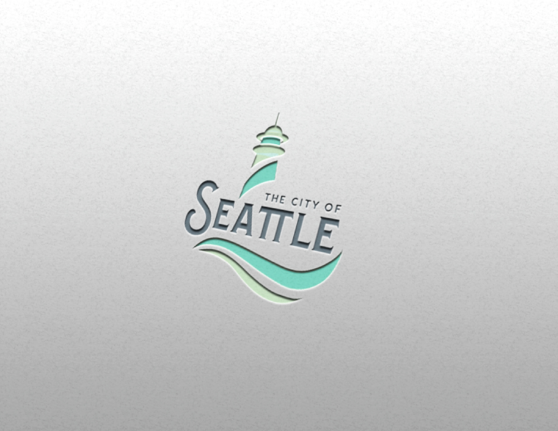
Created logo design that contains both typography and symbol; used an image of the Light House and Ocean Waves to communicate that Seattle geographically located near water and being a port city; developed primary and secondary color palette using shades of classic dark blue with more light and modern turquoise tones; established fonts;
SOFTWARE USED
Adobe Illustrator, Adobe Photoshop.


Logo & Brand Identity Design Concept for The City of Seattle by Tatiana K, TK Create Design (2020)
For inquires, please email TKCreateDesign@gmail.com directly.
Thanks for Watching!